Indigo Recovery
Indigo Recovery is the addiction services branch of a well-established medical practice in New York City, who wanted to give it an image of its own.
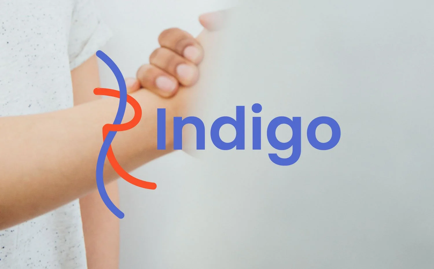
The use of the one-line typeface Edition Asymmetrical on the letters I and R gave us the direction for the new logo. Their lineal, organic character is here to materialise two essential concepts at the core of the brand: human connection, and pathway to recovery. Once assembled, they became the main component of the identity.
Brand identity | Logo design | Social media
Designed at BlankSlate